
Accordion
Single-expand accordion. defaultOpen sets the initially open panel.
Accordion - Default (none open)
An accordion is a vertically stacked set of interactive headings that reveal associated content.
Use accordions to progressively disclose content on pages with limited space or complex information.
Panel content with rich markup and a link.
Accordion - Default (2nd Open)
First panel content.
Set defaultOpen={2} on the <Accordion> component
Show code
{/* Default — none open */}
<Accordion>
  <AccordionItem id={1} title="What is an accordion?">
    <p>Panel content here.</p>
  </AccordionItem>
  <AccordionItem id={2} title="When should I use it?">
    <p>Panel content here.</p>
  </AccordionItem>
</Accordion>

{/* With defaultOpen — 2nd panel open */}
<Accordion defaultOpen={2}>
  <AccordionItem id={1} title="First item">
    <p>First panel content.</p>
  </AccordionItem>
  <AccordionItem id={2} title="Second item (default open)" defaultOpen>
    <p>Set defaultOpen={2} on the Accordion component.</p>
  </AccordionItem>
</Accordion>
Accordion — FAQ Variant
FAQ variant using <dl>/<dt>/<dd> semantics. Same single-expand JS behavior as the default accordion.
FAQ — Default
We offer web design, development, and SEO services for small businesses.
Most projects are completed within 4–8 weeks depending on scope.
Yes, we provide maintenance plans and ongoing support packages.
Show code
{/* FAQ variant — uses dl/dt/dd semantics */}
<Accordion variant="faq">
  <AccordionItem variant="faq" id={1} title="What services do you offer?">
    <p>We offer web design, development, and SEO services.</p>
  </AccordionItem>
  <AccordionItem variant="faq" id={2} title="How long does a project take?">
    <p>Most projects are completed within 4–8 weeks.</p>
  </AccordionItem>
</Accordion>
Accordion — Details Variant
Native <details>/<summary> elements.
Zero JavaScript. Multiple panels can be open simultaneously.
Details — Multiple Open
What is the details variant?
The details variant renders native <details> elements
instead of JS-driven panels. The browser handles open/close natively.
Can multiple be open?
Yes — multiple panels can be open simultaneously. This is native
<details> behavior.
Is there animation?
No animation — snap open/close is the expected native behavior.
Details — With Default Open
First item
This panel is closed by default.
Second item (starts open)
This panel starts open via the native open attribute.
Show code
{/* Details — multiple can be open */}
<Accordion variant="details">
  <AccordionItem variant="details" id={1} title="What is the details variant?">
    <p>Native details/summary elements. Zero JS.</p>
  </AccordionItem>
  <AccordionItem variant="details" id={2} title="Can multiple be open?">
    <p>Yes — multiple panels can be open simultaneously.</p>
  </AccordionItem>
</Accordion>

{/* Details — with default open */}
<Accordion variant="details">
  <AccordionItem variant="details" id={1} title="First item">
    <p>Closed by default.</p>
  </AccordionItem>
  <AccordionItem variant="details" id={2} title="Second item" defaultOpen>
    <p>Starts open via native open attribute.</p>
  </AccordionItem>
</Accordion>
Tabs
Horizontal (default)
Overview panel content. This is the first tab.
Installation panel. Run npm install to get started.
API reference panel with documentation details.
Vertical
Design guidance for this component.
Development notes and integration patterns.
Accessibility requirements and keyboard behavior.
Show code
{/* Horizontal (default) */}
<Tabs tabs={["Overview", "Installation", "API"]}>
  <TabPanel><p>Overview panel content.</p></TabPanel>
  <TabPanel><p>Installation panel content.</p></TabPanel>
  <TabPanel><p>API reference panel content.</p></TabPanel>
</Tabs>

{/* Vertical */}
<Tabs
  tabs={["Design", "Development", "Accessibility"]}
  orientation="vertical"
>
  <TabPanel><p>Design guidance for this component.</p></TabPanel>
  <TabPanel><p>Development notes and integration patterns.</p></TabPanel>
  <TabPanel><p>Accessibility requirements and keyboard behavior.</p></TabPanel>
</Tabs>
Tooltip
Hover or focus the trigger to reveal the tooltip.
Show code
<Tooltip content="Appears above the trigger" placement="top">
  <Button variant="secondary" size="md">Top (default)</Button>
</Tooltip>

<Tooltip content="Appears below the trigger" placement="bottom">
  <Button variant="secondary" size="md">Bottom</Button>
</Tooltip>

<Tooltip content="Appears at the start" placement="start">
  <Button variant="secondary" size="md">Start</Button>
</Tooltip>

<Tooltip content="Appears at the end" placement="end">
  <Button variant="secondary" size="md">End</Button>
</Tooltip>
CopyButton
Copies text to clipboard with 2-second success feedback.
Show code
<CopyButton text="Hello, world!" />

<CopyButton
  text="npm install some-package"
  label="Copy install command"
/>
Code block auto-enhancement
The following code block gets a copy button injected automatically by the copy-code-blocks script:
const greeting = "Hello, world!";
console.log(greeting);
TocInline
Collapsible in-page TOC with vanilla JS toggle. Starts expanded, no sticky positioning or active-link tracking. Used in docs route main content area.
Default (expanded, sample headings)
Custom label
Show code
{/* TocAside — sticky sidebar TOC with active link tracking */}
<TocAside
  slot="aside"
  headings={[
    { depth: 2, slug: "accordion", text: "Accordion" },
    { depth: 2, slug: "tabs", text: "Tabs" },
    { depth: 2, slug: "tooltip", text: "Tooltip" },
  ]}
  activeLinks={true}
/>

{/* TocInline — collapsible in-page TOC */}
<TocInline
  headings={[
    { depth: 2, slug: "accordion", text: "Accordion" },
    { depth: 2, slug: "tabs", text: "Tabs" },
    { depth: 3, slug: "horizontal-default", text: "Horizontal (default)" },
  ]}
/>

{/* TocInline with custom label */}
<TocInline
  headings={[
    { depth: 2, slug: "section-a", text: "Section A" },
    { depth: 2, slug: "section-b", text: "Section B" },
  ]}
  label="Jump to section"
/>
YouTubeEmbed
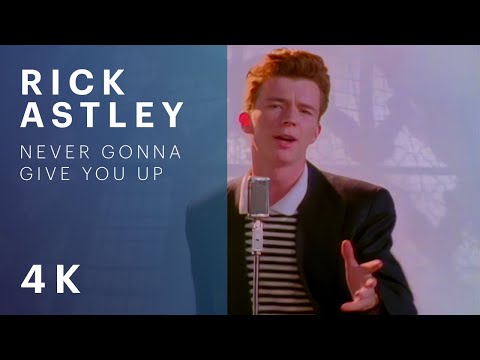
Click-to-load facade with build-time thumbnail caching. Zero third-party requests at page load (REQ-00104 GDPR).
Facade — bare video ID (default 16:9)
Facade — full YouTube URL

Facade — custom aspect ratio (4/3)
Eager mode (direct iframe, no facade)
Show code
{/* Facade — bare video ID */}
<YouTubeEmbed
  id="dQw4w9WgXcQ"
  title="Rick Astley — Never Gonna Give You Up"
/>

{/* Facade — full YouTube URL */}
<YouTubeEmbed
  id="https://www.youtube.com/watch?v=jNQXAC9IVRw"
  title="Me at the zoo — first YouTube video"
/>

{/* Custom aspect ratio */}
<YouTubeEmbed
  id="dQw4w9WgXcQ"
  title="Rick Astley (4:3)"
  aspect="4/3"
/>

{/* Eager mode — no facade, direct iframe */}
<YouTubeEmbed
  id="dQw4w9WgXcQ"
  title="Rick Astley (eager)"
  eager
/>
PostShare
Web Share API button with clipboard copy fallback. Uses data-state for progressive enhancement — button is hidden until JS initializes.
Show code
<PostShare
  url={Astro.url.href}
  title={entry.data.title}
  text={entry.data.description}
/>
Embed
Generic responsive iframe wrapper with privacy-safe defaults.
Default (16:9)
Custom aspect ratio (4/3)
Show code
{/* Default 16:9 */}
<Embed
  src="https://www.openstreetmap.org/export/embed.html?..."
  title="OpenStreetMap — Central London"
/>

{/* Custom aspect ratio */}
<Embed
  src="https://www.openstreetmap.org/export/embed.html?..."
  title="OpenStreetMap — Central London (4:3)"
  aspect="4/3"
/>

{/* With escape hatches */}
<Embed
  src="https://example.com/embed"
  title="Example embed"
  allowFullscreen
  sandbox="allow-scripts allow-same-origin allow-popups"
  allow="fullscreen"
/>